
BOT Conversion Funnels
BOT Conversion Funnels
BOT Conversion Funnels
Conv. Rate
Up +12.9% vs 2023 (per analytics)
Measurement note: Lift is based on the digital analytics team’s model comparing performance to the 2023 baseline for franchise sites.
Est. Incr. Rev. (UI/UX)
$10–15M annual revenue lift (analytics).
I increased appointment conversion by fixing funnel leaks, redesigning YMME to prioritize the highest-converting path, and simplifying nav to stop high-intent users being pulled into the slower Shop Tires flow.
I increased appointment conversion by fixing funnel leaks, redesigning YMME to prioritize the highest-converting path, and simplifying nav to stop high-intent users being pulled into the slower Shop Tires flow.
I increased appointment conversion by fixing funnel leaks, redesigning YMME to prioritize the highest-converting path, and simplifying nav to stop high-intent users being pulled into the slower Shop Tires flow.
Year
2023-2025
Year
2023-2025
Year
2023-2025
Client
Big O Tires
Client
Big O Tires
Client
Big O Tires
Industry
Automotive aftermarket (Franchise B2C).
Industry
Automotive aftermarket (Franchise B2C).
Industry
Automotive aftermarket (Franchise B2C).
Role
Principal UI/UX
Role
Principal UI/UX
Role
Principal UI/UX
Duration
3 Years
Duration
3 Years
Duration
3 Years
Teams
Product, Engineering, Digital Analystics, Brand
Teams
Product, Engineering, Digital Analystics, Brand
Teams
Product, Engineering, Digital Analystics, Brand
Conv. Rate
Up +12.9% vs 2023 (per analytics)
Conv. Rate
Up +12.9% vs 2023 (per analytics)
Conv. Rate
Up +12.9% vs 2023 (per analytics)
Est. Incr. Rev. (UI/UX)
$10–15M annual revenue lift (analytics).
Est. Incr. Rev. (UI/UX)
$10–15M annual revenue lift (analytics).
Est. Incr. Rev. (UI/UX)
$10–15M annual revenue lift (analytics).
Making “REquest Appt” the Fast Lane
I led conversion-focused UX across BOT’s funnels—patching leaks, simplifying YMME + nav, and driving more online appointments scheduled.
Case Studies
The Problem
(Digital Analytics)
The conversion journey had grown noisy and uneven over time: too many competing routes, too much promo distraction, and too many moments where “ready to book” users were asked to think harder than they needed to.
Observations
(Heuristic Analysis)
FullStory replays and analytics showed a consistent pattern: high-intent users would stall or detour - checking promos, opening nav, bouncing between pages - before dropping off. Mobile amplified the issue: clunky selectors, extra steps, and UI that unintentionally nudged users into the longer Shop Tires path when they really just wanted to schedule and sort it out in-store.
Solutions
High Impact Snapshot
I tackled friction at the highest-intent stages first, then scaled improvements upstream:
Green Pill CTA Test - making the “next step” unmistakable—stronger visual priority, less hesitation
Seal funnel leaks by reducing distraction and preserving momentum in critical flows
Make Quick Appointment the “fast lane” through clearer routing and fewer decisions
Simplify entry points (YMME + nav) so high-intent customers aren’t diverted into heavier journeys
Case Studies
UI/UX Research and Design
1) Green Pill CTA
(Checkout + Quick Appointment)
What was happening:
The Checkout and Quick Appointment funnels were still using older bright red, square primary CTAs. They technically worked, but they didn’t create enough “visual gravity” in high-stakes moments—especially when surrounded by other UI elements competing for attention.
What I did:
Replaced the native dropdown experience with a cleaner CTA stack that prioritized Quick Appointment, plus a simplified YMME UI for those who did want to shop.
Impact:
A/B test outcome: +6.71% lift in conversion rate
Revenue impact (assumptions): 70% show-up / match rate Estimated annualized lift: +$4,663,198 in incremental revenue
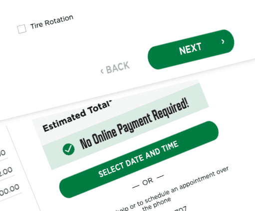
2) Funnel leaks
(reduce micro-exits)
What was happening:
High-intent users were dropping during checkout/booking, often “micro-exiting” to promos or other pages—losing momentum and inviting comparison shopping.
What I did:
Designed a distraction-free checkout mode by removing non-essential global nav (header/footer) inside critical flows, while keeping trust essentials (contact/policies) in a minimal layout; original comps simplified the menu bar further for the Quick Appt Funnel (back CTA + branding only), but the business chose to keep the existing menu bar with the hamburger menu, favorites, and cart.
Impact:
Positive pilot signals and reduced drop-off; conversion gains sustained (peak KPI card ~12.9%+, with exact A/B figures not available post-transition).
Click thumbnail above for before/after views
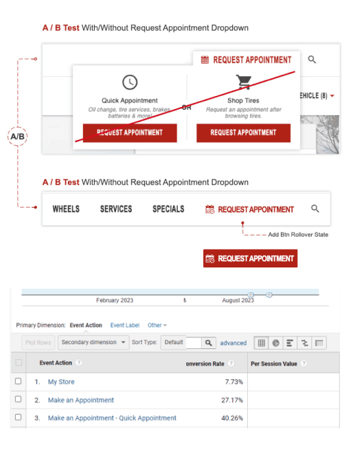
3) Navigation simplification
(stop diverting ready-to-book users)
What was happening
A main-nav “Request Appointment” dropdown was quietly pushing high-intent users into the longer Shop Tires/Checkout journey—when many were trying to book now and decide in-store.
What I did
Using behavioral insights plus Digital Analytics funnel metrics showing Quick Appointment converted higher, I recommended simplifying the nav as a low-hanging fruit / easy dev win. This change would likely complement and compound similar initiatives that routed Services straight into Quick Appointment (instead of Shop Tires/Checkout), since Services lacked upfront pricing and introduced unnecessary friction.
Timing & adoption
I proposed consolidating the dropdown in Aug 2023 based on early signals. It was deprioritized until Digital Analytics validated the shift toward Quick Appointment—then the team shipped quickly using existing wireframes.
Impact
Quick Appointment converted 40.26% vs 27.17% for Quote & Schedule (+13.09pp, ~48% higher) and delivered ~14% higher value per session—reducing choice friction and improving overall funnel performance.
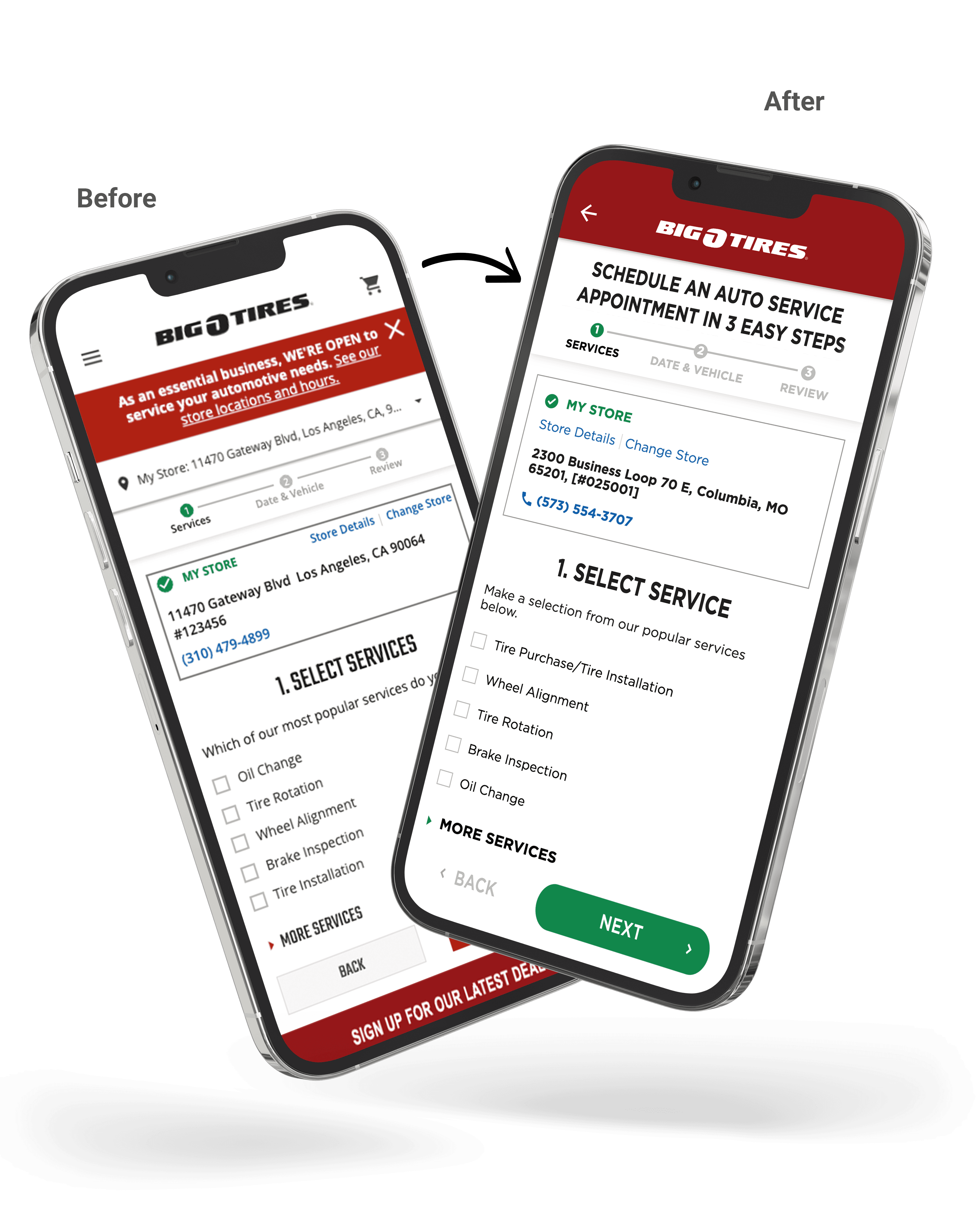
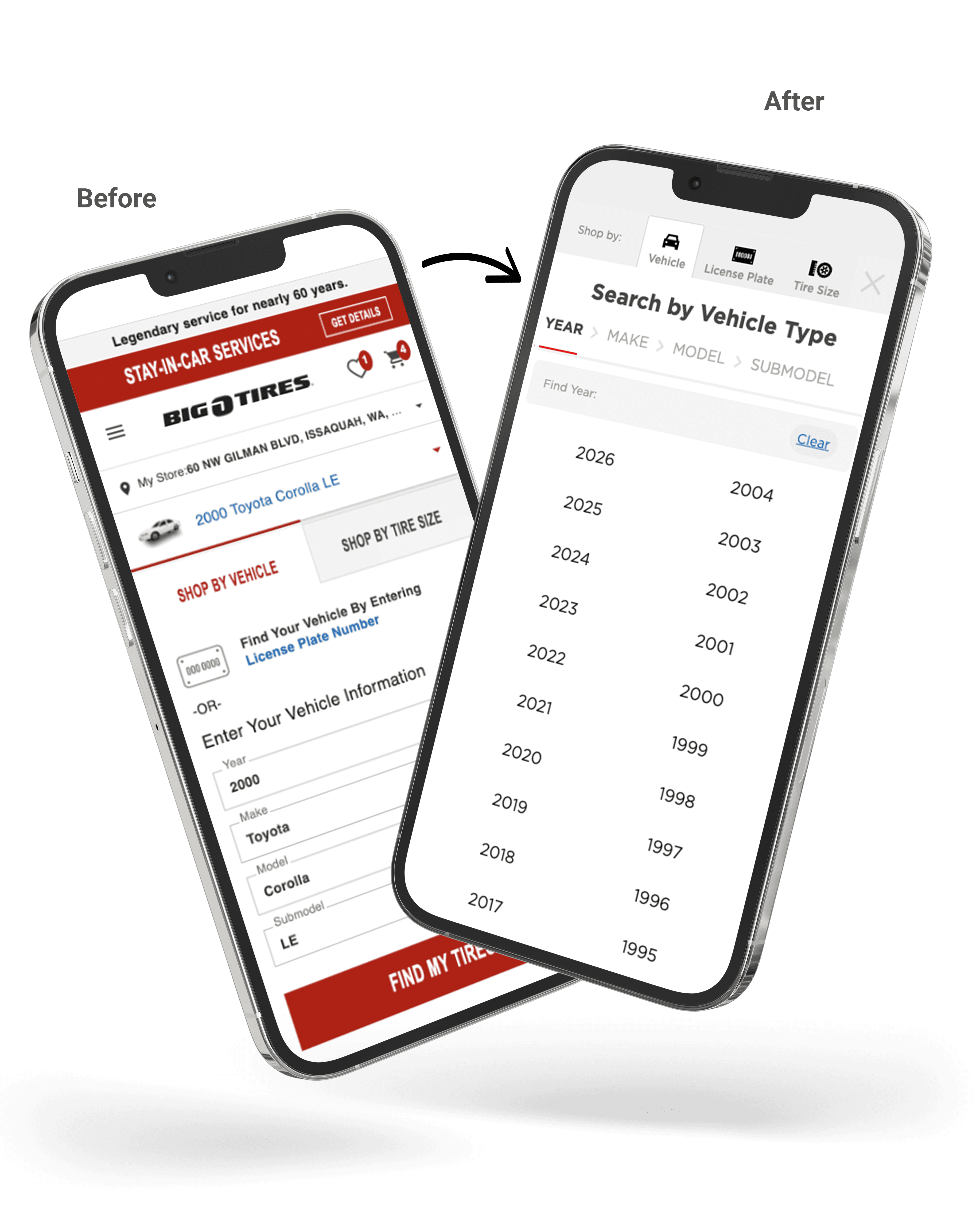
4) YMME redesign
(less effort, better routing)
What was happening:
The homepage YMME selector was clunky on mobile and nudged users into the higher-effort Shop Tires path.
What I did:
Replaced the native dropdown experience with a cleaner CTA stack that prioritized Quick
Appointment, plus a simplified YMME UI for those who did want to shop.
Click thumbnail above for before/after views
Note:
These case studies highlight my UI/UX contributions within a collaborative team environment with Product, Analytics, Engineering, and stakeholders.

{
Get in touch
}
Let’s shape what’s next.

Lea Wenban
Senior/Principle Product Designer (UI/UX)
I build robust enterprise experiences—design systems, end-to-end journeys, and clean UI that goes from concept to launch without drama.
That said, I’m a real person who’s easy to work with, keeps ego in check, and loves constructive critique (bring it on!).
Coffee’s on me (virtually) — drop me a line.
BOT Conversion Funnels
BOT Conversion Funnels
BOT Conversion Funnels
Conv. Rate
Up +12.9% vs 2023 (per analytics)
Measurement note: Lift is based on the digital analytics team’s model comparing performance to the 2023 baseline for franchise sites.
Est. Incr. Rev. (UI/UX)
$10–15M annual revenue lift (analytics).
I increased appointment conversion by fixing funnel leaks, redesigning YMME to prioritize the highest-converting path, and simplifying nav to stop high-intent users being pulled into the slower Shop Tires flow.
I increased appointment conversion by fixing funnel leaks, redesigning YMME to prioritize the highest-converting path, and simplifying nav to stop high-intent users being pulled into the slower Shop Tires flow.
I increased appointment conversion by fixing funnel leaks, redesigning YMME to prioritize the highest-converting path, and simplifying nav to stop high-intent users being pulled into the slower Shop Tires flow.
Year
2023-2025
Year
2023-2025
Year
2023-2025
Client
Big O Tires
Client
Big O Tires
Client
Big O Tires
Industry
Automotive aftermarket (Franchise B2C).
Industry
Automotive aftermarket (Franchise B2C).
Industry
Automotive aftermarket (Franchise B2C).
Role
Principal UI/UX
Role
Principal UI/UX
Role
Principal UI/UX
Duration
3 Years
Duration
3 Years
Duration
3 Years
Teams
Product, Engineering, Digital Analystics, Brand
Teams
Product, Engineering, Digital Analystics, Brand
Teams
Product, Engineering, Digital Analystics, Brand
Conv. Rate
Up +12.9% vs 2023 (per analytics)
Conv. Rate
Up +12.9% vs 2023 (per analytics)
Conv. Rate
Up +12.9% vs 2023 (per analytics)
Est. Incr. Rev. (UI/UX)
$10–15M annual revenue lift (analytics).
Est. Incr. Rev. (UI/UX)
$10–15M annual revenue lift (analytics).
Est. Incr. Rev. (UI/UX)
$10–15M annual revenue lift (analytics).
Making “REquest Appt” the Fast Lane
I led conversion-focused UX across BOT’s funnels—patching leaks, simplifying YMME + nav, and driving more online appointments scheduled.
Case Studies
The Problem
(Digital Analytics)
The conversion journey had grown noisy and uneven over time: too many competing routes, too much promo distraction, and too many moments where “ready to book” users were asked to think harder than they needed to.
Observations
(Heuristic Analysis)
FullStory replays and analytics showed a consistent pattern: high-intent users would stall or detour - checking promos, opening nav, bouncing between pages - before dropping off. Mobile amplified the issue: clunky selectors, extra steps, and UI that unintentionally nudged users into the longer Shop Tires path when they really just wanted to schedule and sort it out in-store.
Solutions
High Impact Snapshot
I tackled friction at the highest-intent stages first, then scaled improvements upstream:
Green Pill CTA Test - making the “next step” unmistakable—stronger visual priority, less hesitation
Seal funnel leaks by reducing distraction and preserving momentum in critical flows
Make Quick Appointment the “fast lane” through clearer routing and fewer decisions
Simplify entry points (YMME + nav) so high-intent customers aren’t diverted into heavier journeys
I tackled friction at the highest-intent stages first, then scaled improvements upstream:
Green Pill CTA Test - making the “next step” unmistakable—stronger visual priority, less hesitation
Seal funnel leaks by reducing distraction and preserving momentum in critical flows
Make Quick Appointment the “fast lane” through clearer routing and fewer decisions
Simplify entry points (YMME + nav) so high-intent customers aren’t diverted into heavier journeys
I tackled friction at the highest-intent stages first, then scaled improvements upstream:
Green Pill CTA Test - making the “next step” unmistakable—stronger visual priority, less hesitation
Seal funnel leaks by reducing distraction and preserving momentum in critical flows
Make Quick Appointment the “fast lane” through clearer routing and fewer decisions
Simplify entry points (YMME + nav) so high-intent customers aren’t diverted into heavier journeys
Case Studies
UI/UX Research and Design
1) Green Pill CTA
(Checkout + Quick Appointment)
What was happening:
The Checkout and Quick Appointment funnels were still using older bright red, square primary CTAs. They technically worked, but they didn’t create enough “visual gravity” in high-stakes moments—especially when surrounded by other UI elements competing for attention.
What I did:
Replaced the native dropdown experience with a cleaner CTA stack that prioritized Quick Appointment, plus a simplified YMME UI for those who did want to shop.
Impact:
A/B test outcome: +6.71% lift in conversion rate
Revenue impact (assumptions): 70% show-up / match rate Estimated annualized lift: +$4,663,198 in incremental revenue
(Checkout + Quick Appointment)
What was happening:
The Checkout and Quick Appointment funnels were still using older bright red, square primary CTAs. They technically worked, but they didn’t create enough “visual gravity” in high-stakes moments—especially when surrounded by other UI elements competing for attention.
What I did:
Replaced the native dropdown experience with a cleaner CTA stack that prioritized Quick Appointment, plus a simplified YMME UI for those who did want to shop.
Impact:
A/B test outcome: +6.71% lift in conversion rate
Revenue impact (assumptions): 70% show-up / match rate Estimated annualized lift: +$4,663,198 in incremental revenue
(Checkout + Quick Appointment)
What was happening:
The Checkout and Quick Appointment funnels were still using older bright red, square primary CTAs. They technically worked, but they didn’t create enough “visual gravity” in high-stakes moments—especially when surrounded by other UI elements competing for attention.
What I did:
Replaced the native dropdown experience with a cleaner CTA stack that prioritized Quick Appointment, plus a simplified YMME UI for those who did want to shop.
Impact:
A/B test outcome: +6.71% lift in conversion rate
Revenue impact (assumptions): 70% show-up / match rate Estimated annualized lift: +$4,663,198 in incremental revenue
2) Funnel leaks
(reduce micro-exits)
What was happening:
High-intent users were dropping during checkout/booking, often “micro-exiting” to promos or other pages—losing momentum and inviting comparison shopping.
What I did:
Designed a distraction-free checkout mode by removing non-essential global nav (header/footer) inside critical flows, while keeping trust essentials (contact/policies) in a minimal layout; original comps simplified the menu bar further for the Quick Appt Funnel (back CTA + branding only), but the business chose to keep the existing menu bar with the hamburger menu, favorites, and cart.
Impact:
Positive pilot signals and reduced drop-off; conversion gains sustained (peak KPI card ~12.9%+, with exact A/B figures not available post-transition).
(reduce micro-exits)
What was happening:
High-intent users were dropping during checkout/booking, often “micro-exiting” to promos or other pages—losing momentum and inviting comparison shopping.
What I did:
Designed a distraction-free checkout mode by removing non-essential global nav (header/footer) inside critical flows, while keeping trust essentials (contact/policies) in a minimal layout; original comps simplified the menu bar further for the Quick Appt Funnel (back CTA + branding only), but the business chose to keep the existing menu bar with the hamburger menu, favorites, and cart.
Impact:
Positive pilot signals and reduced drop-off; conversion gains sustained (peak KPI card ~12.9%+, with exact A/B figures not available post-transition).
(reduce micro-exits)
What was happening:
High-intent users were dropping during checkout/booking, often “micro-exiting” to promos or other pages—losing momentum and inviting comparison shopping.
What I did:
Designed a distraction-free checkout mode by removing non-essential global nav (header/footer) inside critical flows, while keeping trust essentials (contact/policies) in a minimal layout; original comps simplified the menu bar further for the Quick Appt Funnel (back CTA + branding only), but the business chose to keep the existing menu bar with the hamburger menu, favorites, and cart.
Impact:
Positive pilot signals and reduced drop-off; conversion gains sustained (peak KPI card ~12.9%+, with exact A/B figures not available post-transition).
Click thumbnail above for before/after views
3) Navigation simplification
(stop diverting ready-to-book users)
What was happening
A main-nav “Request Appointment” dropdown was quietly pushing high-intent users into the longer Shop Tires/Checkout journey—when many were trying to book now and decide in-store.
What I did
Using behavioral insights plus Digital Analytics funnel metrics showing Quick Appointment converted higher, I recommended simplifying the nav as a low-hanging fruit / easy dev win. This change would likely complement and compound similar initiatives that routed Services straight into Quick Appointment (instead of Shop Tires/Checkout), since Services lacked upfront pricing and introduced unnecessary friction.
Timing & adoption
I proposed consolidating the dropdown in Aug 2023 based on early signals. It was deprioritized until Digital Analytics validated the shift toward Quick Appointment—then the team shipped quickly using existing wireframes.
Impact
Quick Appointment converted 40.26% vs 27.17% for Quote & Schedule (+13.09pp, ~48% higher) and delivered ~14% higher value per session—reducing choice friction and improving overall funnel performance.
(stop diverting ready-to-book users)
What was happening
A main-nav “Request Appointment” dropdown was quietly pushing high-intent users into the longer Shop Tires/Checkout journey—when many were trying to book now and decide in-store.
What I did
Using behavioral insights plus Digital Analytics funnel metrics showing Quick Appointment converted higher, I recommended simplifying the nav as a low-hanging fruit / easy dev win. This change would likely complement and compound similar initiatives that routed Services straight into Quick Appointment (instead of Shop Tires/Checkout), since Services lacked upfront pricing and introduced unnecessary friction.
Timing & adoption
I proposed consolidating the dropdown in Aug 2023 based on early signals. It was deprioritized until Digital Analytics validated the shift toward Quick Appointment—then the team shipped quickly using existing wireframes.
Impact
Quick Appointment converted 40.26% vs 27.17% for Quote & Schedule (+13.09pp, ~48% higher) and delivered ~14% higher value per session—reducing choice friction and improving overall funnel performance.
(stop diverting ready-to-book users)
What was happening
A main-nav “Request Appointment” dropdown was quietly pushing high-intent users into the longer Shop Tires/Checkout journey—when many were trying to book now and decide in-store.
What I did
Using behavioral insights plus Digital Analytics funnel metrics showing Quick Appointment converted higher, I recommended simplifying the nav as a low-hanging fruit / easy dev win. This change would likely complement and compound similar initiatives that routed Services straight into Quick Appointment (instead of Shop Tires/Checkout), since Services lacked upfront pricing and introduced unnecessary friction.
Timing & adoption
I proposed consolidating the dropdown in Aug 2023 based on early signals. It was deprioritized until Digital Analytics validated the shift toward Quick Appointment—then the team shipped quickly using existing wireframes.
Impact
Quick Appointment converted 40.26% vs 27.17% for Quote & Schedule (+13.09pp, ~48% higher) and delivered ~14% higher value per session—reducing choice friction and improving overall funnel performance.
4) YMME redesign
(less effort, better routing)
What was happening:
The homepage YMME selector was clunky on mobile and nudged users into the higher-effort Shop Tires path.
What I did:
Replaced the native dropdown experience with a cleaner CTA stack that prioritized Quick
Appointment, plus a simplified YMME UI for those who did want to shop.
(less effort, better routing)
What was happening:
The homepage YMME selector was clunky on mobile and nudged users into the higher-effort Shop Tires path.
What I did:
Replaced the native dropdown experience with a cleaner CTA stack that prioritized Quick
Appointment, plus a simplified YMME UI for those who did want to shop.
(less effort, better routing)
What was happening:
The homepage YMME selector was clunky on mobile and nudged users into the higher-effort Shop Tires path.
What I did:
Replaced the native dropdown experience with a cleaner CTA stack that prioritized Quick
Appointment, plus a simplified YMME UI for those who did want to shop.
Click thumbnail above for before/after views
Note:
These case studies highlight my UI/UX contributions within a collaborative team environment with Product, Analytics, Engineering, and stakeholders.
{
Get in touch
}
Let’s shape what’s next.
Lea Wenban
Senior/Principle Product Designer (UI/UX)
I build robust enterprise experiences—design systems, end-to-end journeys, and clean UI that goes from concept to launch without drama.
That said, I’m a real person who’s easy to work with, keeps ego in check, and loves constructive critique (bring it on!).
Coffee’s on me (virtually) — drop me a line.